

Cyllo Studio Documentation
Introduction
1.1 What is Cyllo Studio?
Cyllo Studio is a no-code/low-code application builder built directly into Cyllo ERP. It empowers business users, administrators, and consultants to design new data models, customize views, define access rules, and generate entire applications from plain-language prompts — all from within the Cyllo interface, without writing a single line of code. Studio is composed of four core capabilities: the Model Designer for creating and managing database models, the View Designer for customizing how data is displayed, the Access Control manager for securing records per user role, and Studio AI for generating complete applications from natural-language descriptions. Because Studio operates on the same centralized Cyllo ERP database, every customization is immediately available across all connected modules. Studio is the foundation of Cyllo's "Configuration over Custom Code" philosophy, enabling faster deployments and greater business agility.
1.2 Who should use it?
- ERP Administrators who need to add fields, adjust layouts, or control access without involving developers.
- Business Analysts building new data-capture apps to match a specific workflow.
- Implementation Teams customizing Cyllo for a client during rollout.
Note
Studio is restricted to users with the ERP Manager permission. Users without this permission will not see the Studio icon and cannot access Studio features.
1.3 Entering and exiting Studio mode
How to enter Studio:
- Click the Cyllo Studio systray icon in the top-right corner of the Cyllo interface.
- The page reloads in Studio mode , the navbar changes to the Studio navbar and a left sidebar showing the full application menu tree appears.
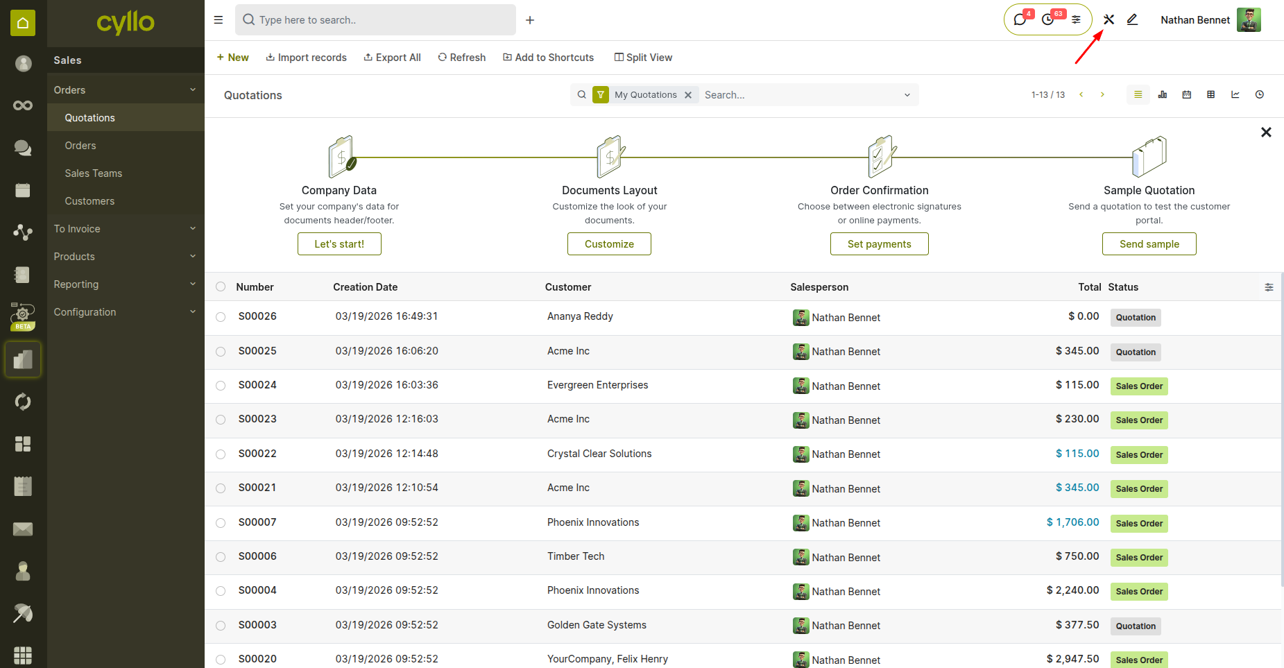
Fig 1.1 — Cyllo interface with the Studio systray icon highlighted in the top-right corner
How to exit Studio:
- Click the EXIT button in the Studio navbar.
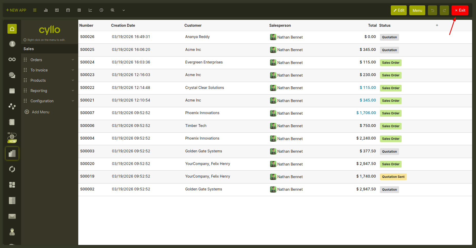
Fig 1.2 — Studio navbar showing the EXIT button
2. App & Menu Management
2.1 Creating a new app
A new app in Cyllo Studio means a new top-level menu entry backed by its own data store. When you create a new app, Studio sets everything up for you automatically — the database structure, default screens, navigation menus, and user permissions — in a single step. How to create a new app:
- In Studio mode, click the New App button in the toolbar.
- Enter the app name and choose an icon (from the icon library or upload a custom image).
- Choose whether to create a brand new data model or build on an existing Cyllo module (see Section 2.2).
- Select the default view type — list, kanban, or form — and any additional views to include.
- Optionally restrict which user group can see the app in the menu.
- Confirm. The app appears immediately in the navigation menu.
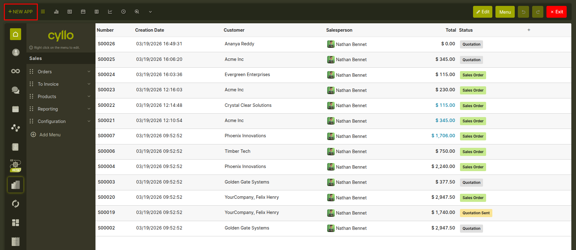
Fig 2.1 — New App creation screen with app details and view configuration options.
Note
If you choose only a kanban view as the default, Studio automatically adds a form view as well, since kanban cards need a form to open individual records.
2.2 Building on an existing module
Instead of creating a brand new data store, you can create a new menu entry that points to an existing Cyllo module — for example, a dedicated shortcut to Sales Orders or Invoices with a pre-filtered view tailored to a specific team. The wizard lets you search for and select any non-abstract model already installed in Cyllo.
2.3 Editing app name, icon, and access
After an app is created, you can change its name, icon, and the user groups allowed to see it at any time. In the Studio left sidebar, hover over the app and click the pencil icon that appears, or right-click the app to open its properties panel.
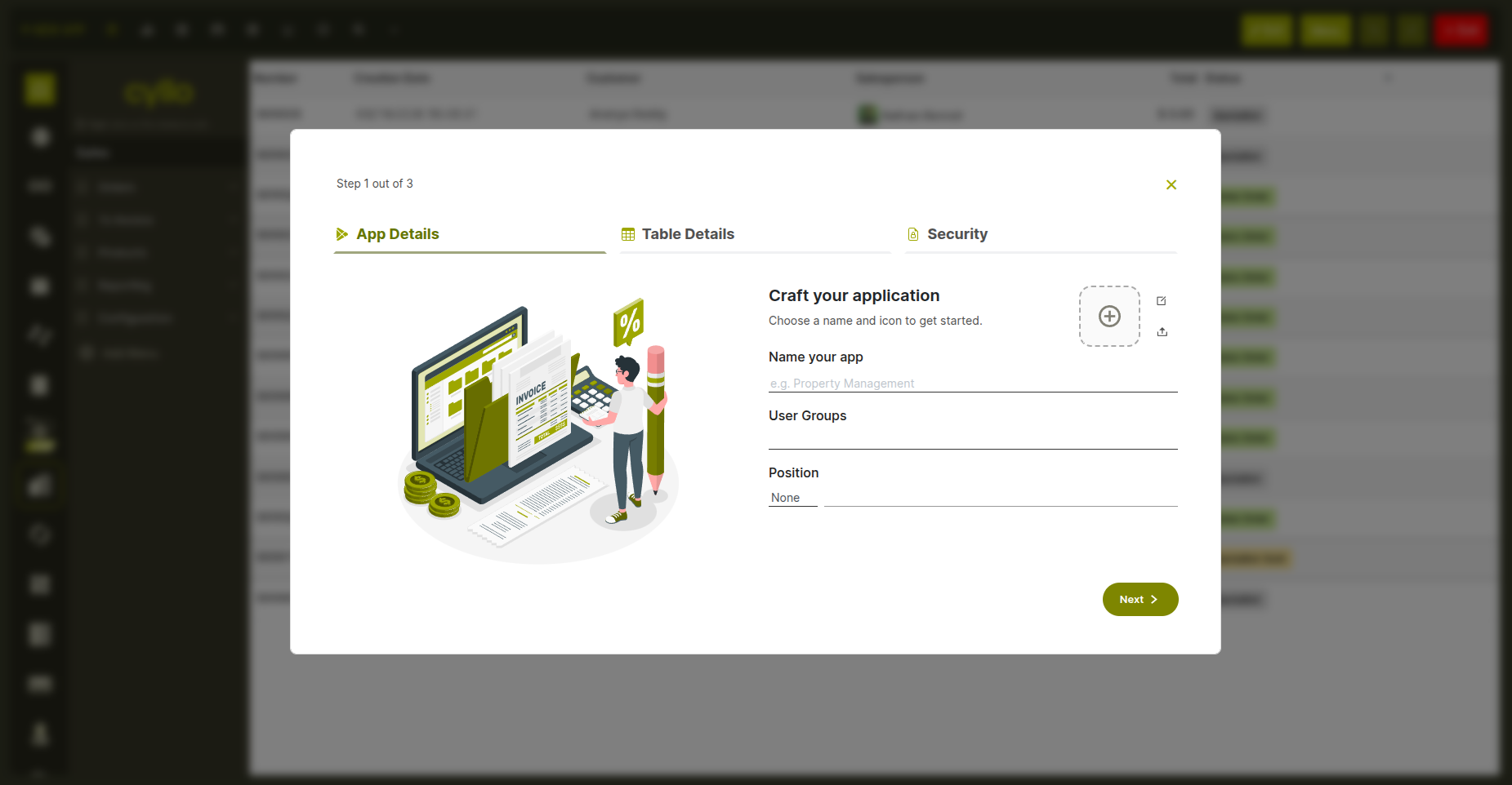
Fig 2.2 — New App wizard steps showing application setup, including app details configuration.
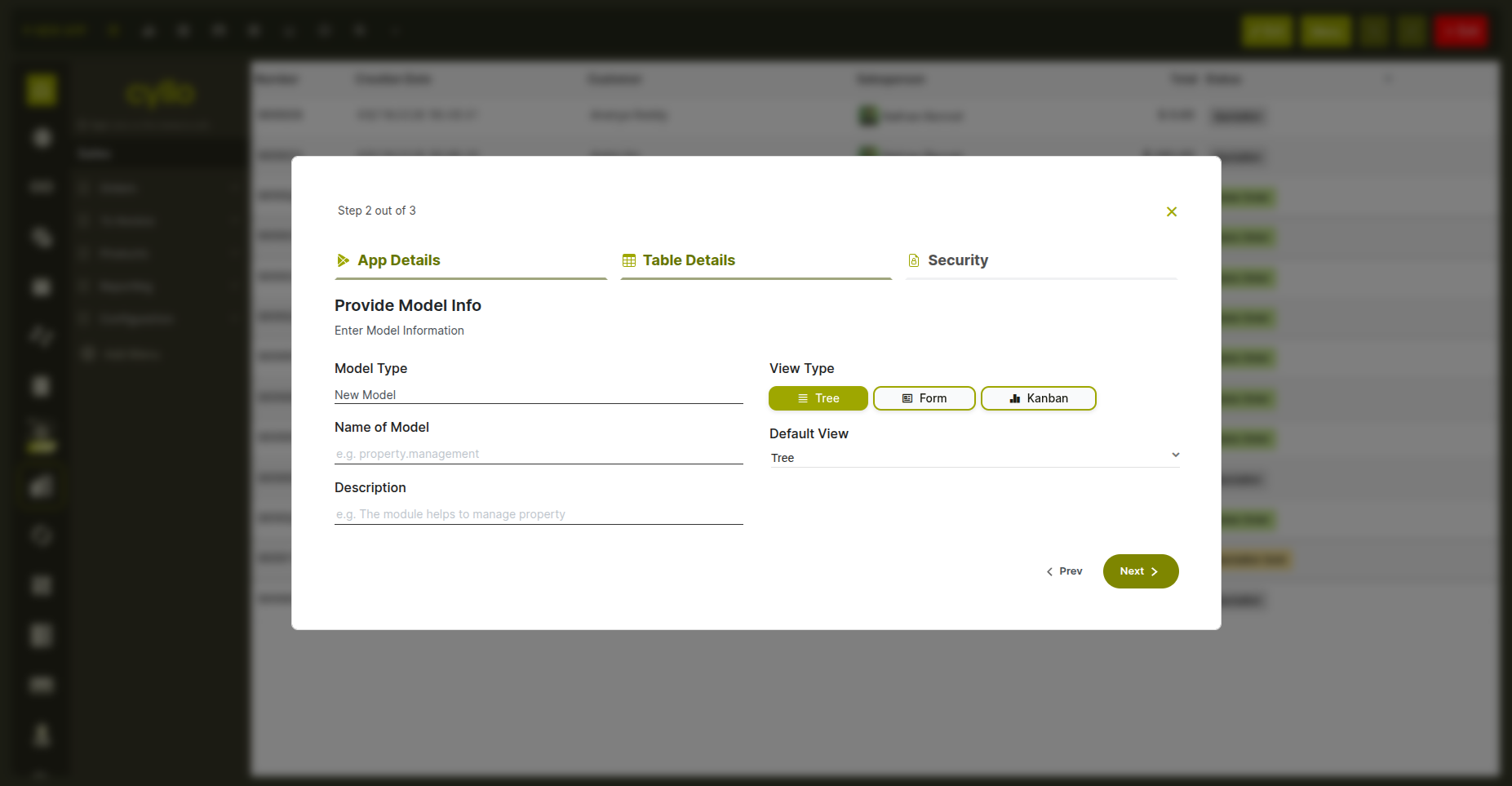
Fig 2.3 — Showing to set up the table details,such as the data model and view type selection.
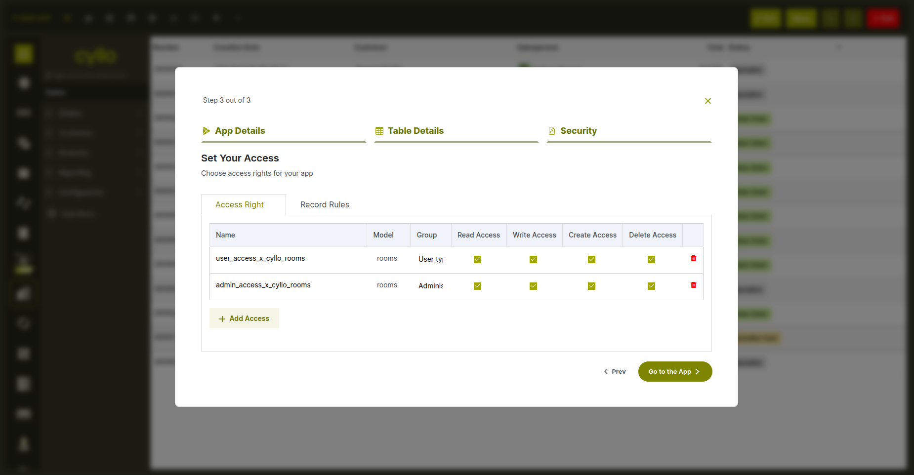
Fig 2.4 — Set the Access rights for the module..
2.4 Managing menus — rename, move, delete
The Studio left sidebar shows the full navigation tree of all apps and their sub-menus. You have complete control over this tree:
- Rename: Right-click any menu item and edit its name in the properties panel.
- Reorder: Drag menu items up or down within the same level to change their order. Top-level apps and sub-menus can both be dragged.
- Delete: Remove a menu item and its associated action from the navigation.
- Deactivate / reactivate: Hide a menu from normal users without deleting it. Deactivated menus show a striped pattern in the Studio sidebar so you know they exist but are hidden.
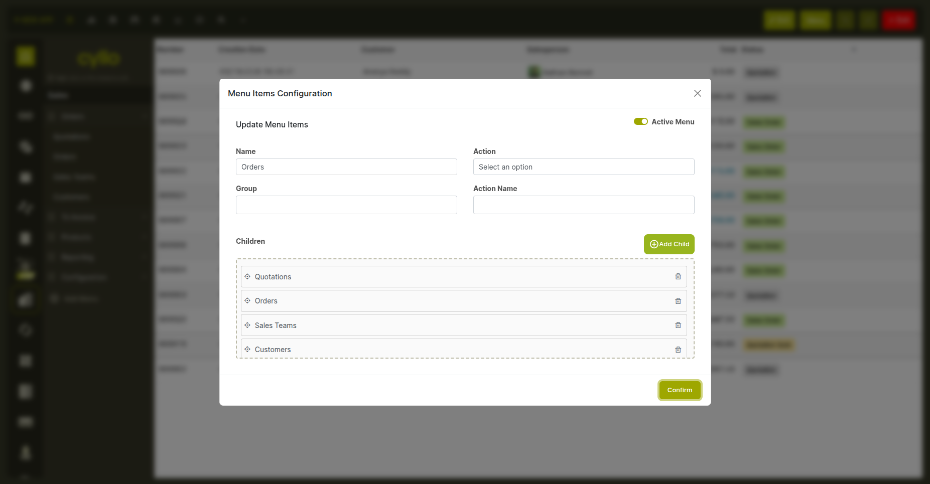
Fig 2.5 — Studio sidebar navigation tree with a deactivated menu item shown with striped pattern
3. Model & Field Management
3.1 What gets created automatically with a new app
When you create a new app with a new model, Studio sets up the following automatically so the app works immediately without any further configuration:
- A default form screen with a name field at the top.
- A default list screen showing record names.
- A default search bar so users can search and filter records.
- A navigation menu entry linking to the new app.
- User permissions — regular users can create, read, and edit records; administrators additionally have permission to delete.
- An archive toggle so records can be archived and unarchived rather than permanently deleted.
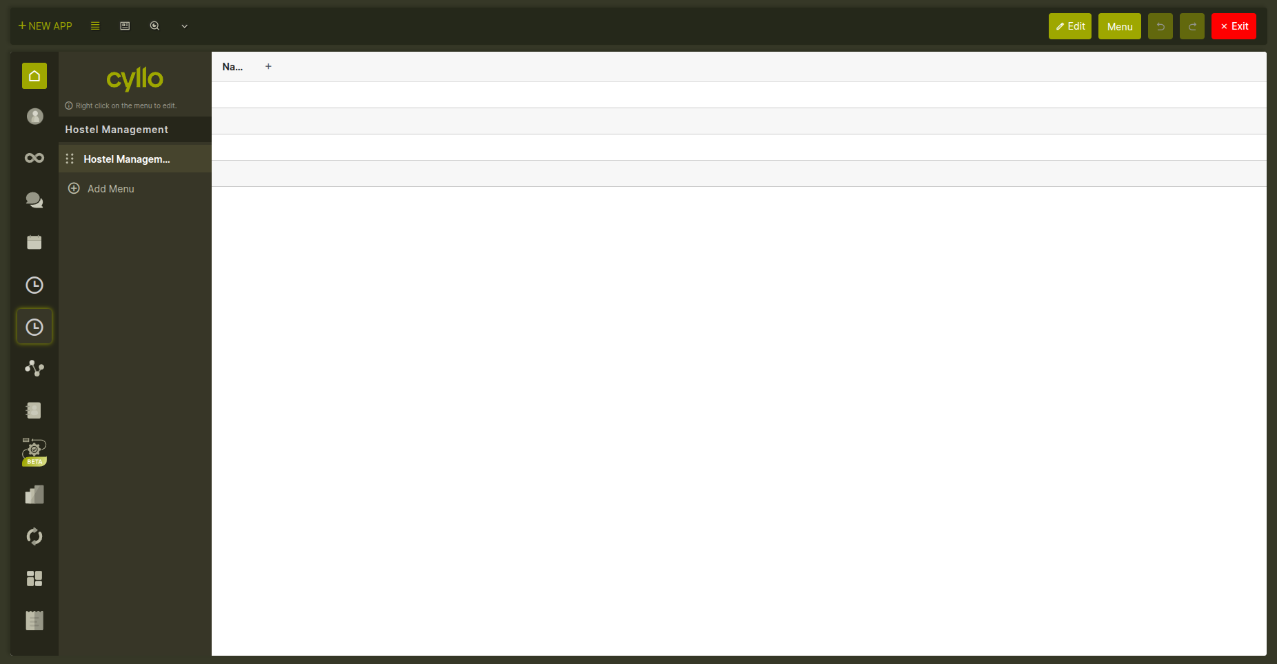
Fig 3.1 — Newly created app interface displaying the default navigation menu and initial list view generated by Studio.
3.2 Adding fields to a model
Fields are added from the right-side properties panel while editing any view in Studio. You can add new fields or bring in existing fields that are already defined on the model but not yet shown on the current screen. How to add a new field:
- Open the form or list view of the model in Studio edit mode.
- In the right panel, choose a field type from the list.
- Enter a label, a short internal name, and optionally a help text (shown as a tooltip).
- Drag the field onto the form at the desired position, or confirm to add it to the list.
- The field is saved to the model immediately and appears on the screen for all users.
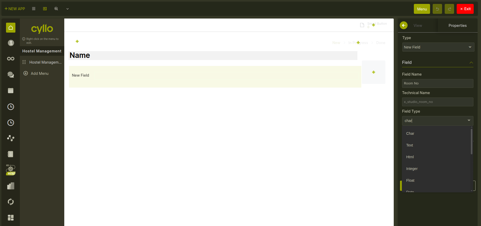
Fig 3.2 — Studio view editor with the right-side field panel open, showing field type options and drag-to-place interaction
Note
Removing a field from a screen does not delete the field or its data — it only hides it from that particular view. The field and all stored values remain intact and can be re-added to any view at any time.
3.3 All supported field types
Cyllo Studio supports the following field types when adding a new field to a model:
- Single-line text (Char) — for names, codes, short labels, and references.
- Multi-line text (Text) — for longer notes, descriptions, or free-form comments.
- Rich text (HTML) — for formatted content with bold, italic, bullet points, and links.
- Whole number (Integer) — for quantities, counts, and other non-decimal values.
- Decimal number (Float) — for measurements, percentages, and values with decimal places.
- Currency amount (Monetary) — for prices and financial values, linked to a currency field.
- Date — stores a calendar date without a time component.
- Date and time (DateTime) — stores a full timestamp including hours and minutes.
- Yes / No (Boolean) — a checkbox for binary true/false values.
- Dropdown (Selection) — a predefined list of options the user picks from.
- File / Attachment (Binary) — allows uploading any file type to the record.
- Image — stores an image directly on the record, displayed as a thumbnail.
- Link to one record (Many2one) — links this record to a single record from another model (e.g. link an inspection to a customer).
- Linked list (One2many) — shows a list of related child records on the form (e.g. order lines on a sales order).
- Link to many records (Many2many) — links this record to multiple records from another model (e.g. tags on a product).
3.4 Field validation rules
Studio lets you set rules that validate field data when a record is saved. There are two kinds: Database-level constraints: These are enforced by the database engine itself. Common uses include ensuring a field value is unique across all records, or that a numeric value always falls within a certain range. If a constraint is violated, saving the record is blocked with an error message. Business logic constraints: These are written as simple conditions in Python and run when a record is saved. You specify which fields trigger the check and write the validation logic. For example, you can ensure that an end date is never earlier than a start date, or that a budget field never exceeds a maximum. A clear error message is shown to the user when the condition fails.
3.5 Setting the display name
The display name is what appears when this model's records are shown in dropdowns and links from other modules. By default it uses the name field created with the app. You can change it to any other single-line text field on the model from the field properties panel.
4. View Editor
4.1 Supported view types
Cyllo Studio can customize eight different view types for any model. The view type switcher in the Studio toolbar shows all available types for the model you are currently editing:
- List — rows and columns of records, like a spreadsheet.
- Form — a detailed screen for viewing and editing a single record.
- Kanban — cards organized in columns by stage or category.
- Search — controls the search bar, predefined filters, and group-by options.
- Calendar — records displayed on a calendar by date or date range.
- Graph — bar, line, or pie charts built from model data.
- Pivot — a cross-table for summarizing and comparing data.
- Activity — shows scheduled activities per record (available on models that support messaging). View types that do not yet exist for a model can be created on demand by clicking them in the switcher. A minimum of two view types must remain active at all times.
4.2 How Studio saves view changes
Studio never overwrites the original view that came with the module. Instead, it saves all your customizations as a separate layer that is applied on top of the original. This means the base module is always preserved — if you reset a view, the original layout returns exactly as it was. Every change you make in the view editor is saved immediately and takes effect for all users as soon as you leave edit mode.
4.3 Form view
The form view editor is the most flexible editor in Studio. It lets you design exactly how a record looks when opened. What you can do in the form view editor:
- Add new fields — drag a field from the right panel and drop it anywhere on the form.
- Add existing fields — bring in a field already on the model that isn't shown yet.
- Add tabs — organize content into tab sections. Tabs can be renamed, reordered, and removed.
- Add a status bar — add a pipeline progress bar at the top of the form, driven by a selection or stage field.
- Add smart buttons — the stat buttons that appear at the top of many Cyllo forms (e.g. "3 Invoices"). You can add, configure, move, and remove them.
- Add a chatter — toggle the message thread and activity log at the bottom of the form on or off.
- Add a ribbon / banner — a colored label that overlays the form (e.g. "Archived" or "Pending Approval"), shown based on a field condition.
- Add an avatar image — place a profile picture or custom image field in the form header.
- Reorder fields — drag fields to move them to a different position.
- Remove fields from view — click a field and remove it. The field and its data are not deleted.
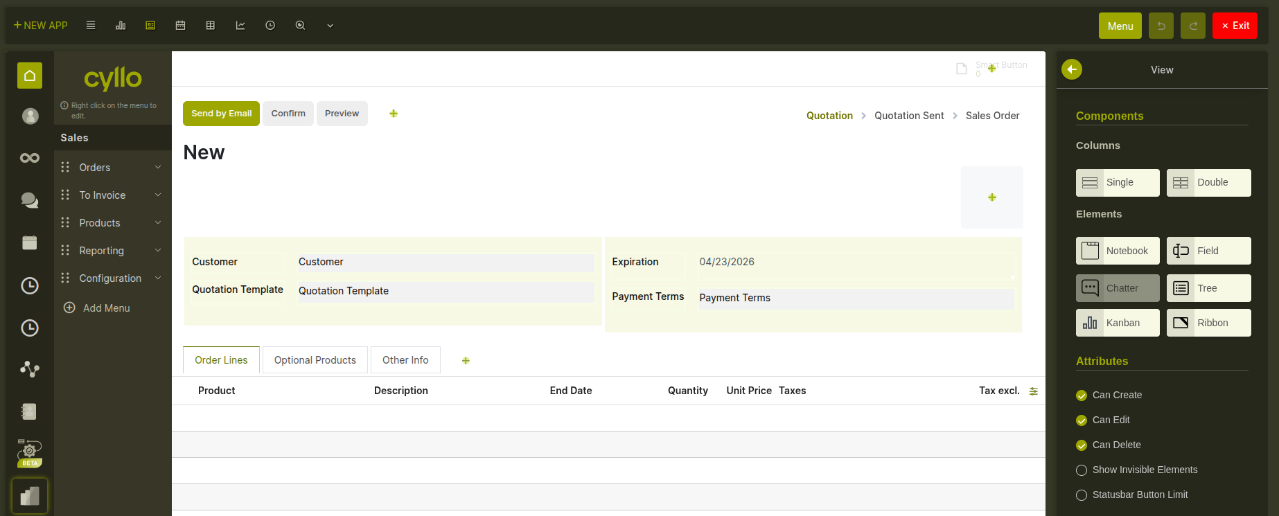
Fig 4.1 — Form view editor showing drag-and-drop canvas, right properties panel, and field controls
Field display properties: Clicking any field on the form opens its properties in the right panel. You can configure:
- Label — change the display label for this field on this screen only.
- Required — make the field mandatory. Can be always required or only required when a condition is met.
- Read-only — prevent editing. Can be always read-only or conditional.
- Invisible — hide the field entirely. Can be always hidden or shown/hidden based on another field's value.
- Placeholder — text shown inside the field when it is empty, as a hint to the user.
- Tooltip — a help text shown when the user hovers over the field label.
- Default value — a pre-filled value when a new record is created.
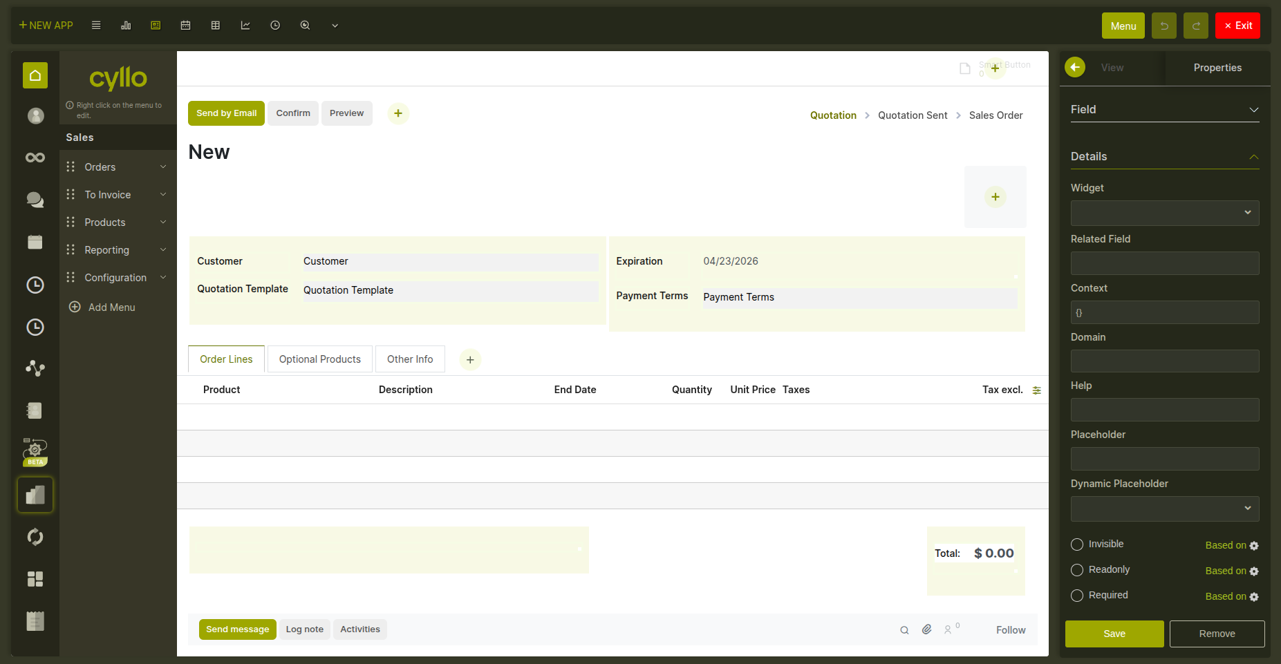
Fig 4.2 — Field properties panel showing Required, Read-only, Invisible, Placeholder, Tooltip, and Default value settings
4.4 List view
The list view editor lets you choose which columns appear in the records table and in what order.
- Add a column — drag a field from the right panel into the column list.
- Reorder columns — drag columns left or right to change their display order.
- Remove a column — click the column and remove it from the view.
- Editable rows — toggle whether users can edit records directly in the list without opening a form. Two positions available: edit at the top or bottom of the list.
- Optional columns — mark a column as optional so end users can show or hide it themselves using the column settings icon in the list header.
Fig 4.3 — List view editor showing column order controls, editable rows toggle, and optional column setting
4.5 Kanban view
The Kanban editor lets you design what appears on each card and how the board behaves.
- Card fields — add or remove fields displayed on the card. Control whether they appear bold, muted, or as a regular label.
- Ribbon / label — a colored strip that appears diagonally across the card corner (e.g. "Urgent", "Overdue") based on a field condition. Configure the text, color, and the condition that triggers it.
- Color coding — assign a color to each card based on a field value (e.g. priority). Users can also change a card's color by clicking the color dot.
- Progress bar — a bar at the bottom of each Kanban column showing how many records are in each sub-status. Colors per status value are configurable.
- Card action menu — toggle the three-dot action menu that appears on card hover.
- Card size — a scale slider in the toolbar lets you preview cards at 50% to 300% size.
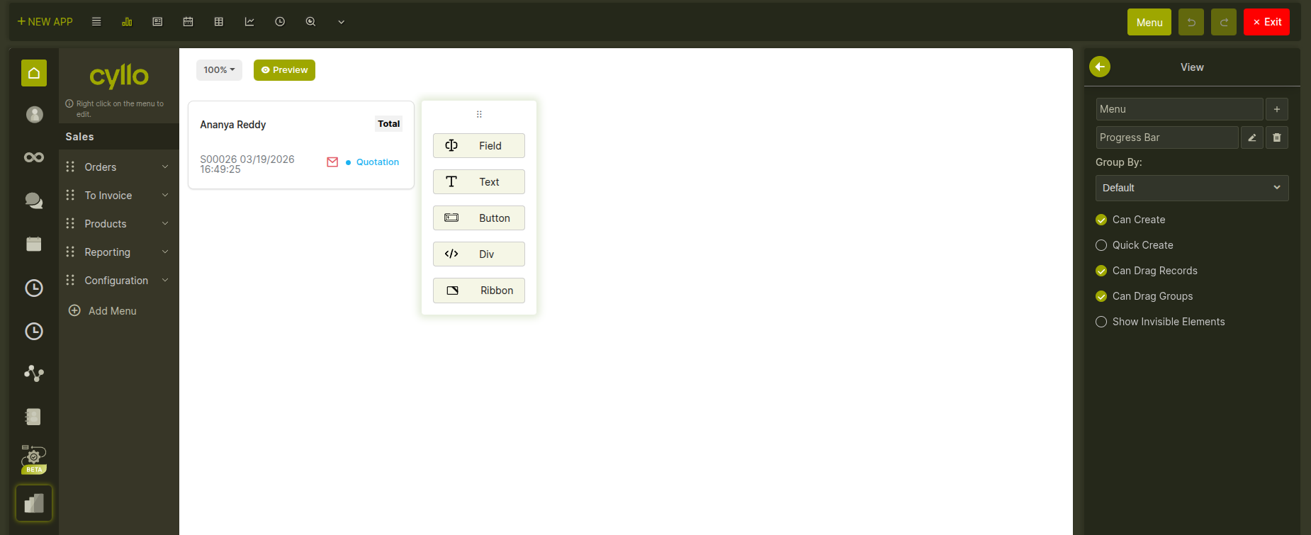
Fig 4.4 — Kanban view editor showing a card with ribbon, progress bar, and the card size slider in the toolbar
4.6 Search view
The search view controls what tools users have to find and filter records. Editing the search view affects the search bar at the top of any list or kanban.
- Search fields — fields included in the search. When a user types, Cyllo searches across all configured search fields.
- Predefined filters — one-click filters that appear under the search bar (e.g. "My Records", "Active this Week"). Each filter has a name and a condition.
- Group by options — lets users group records by a specific field. Date fields support grouping by day, week, month, quarter, or year.
- Separators — visual dividers between filter groups in the dropdown.
- Search panel — a persistent left-side panel with category filters and value selectors, giving users a checklist-style way to filter records.
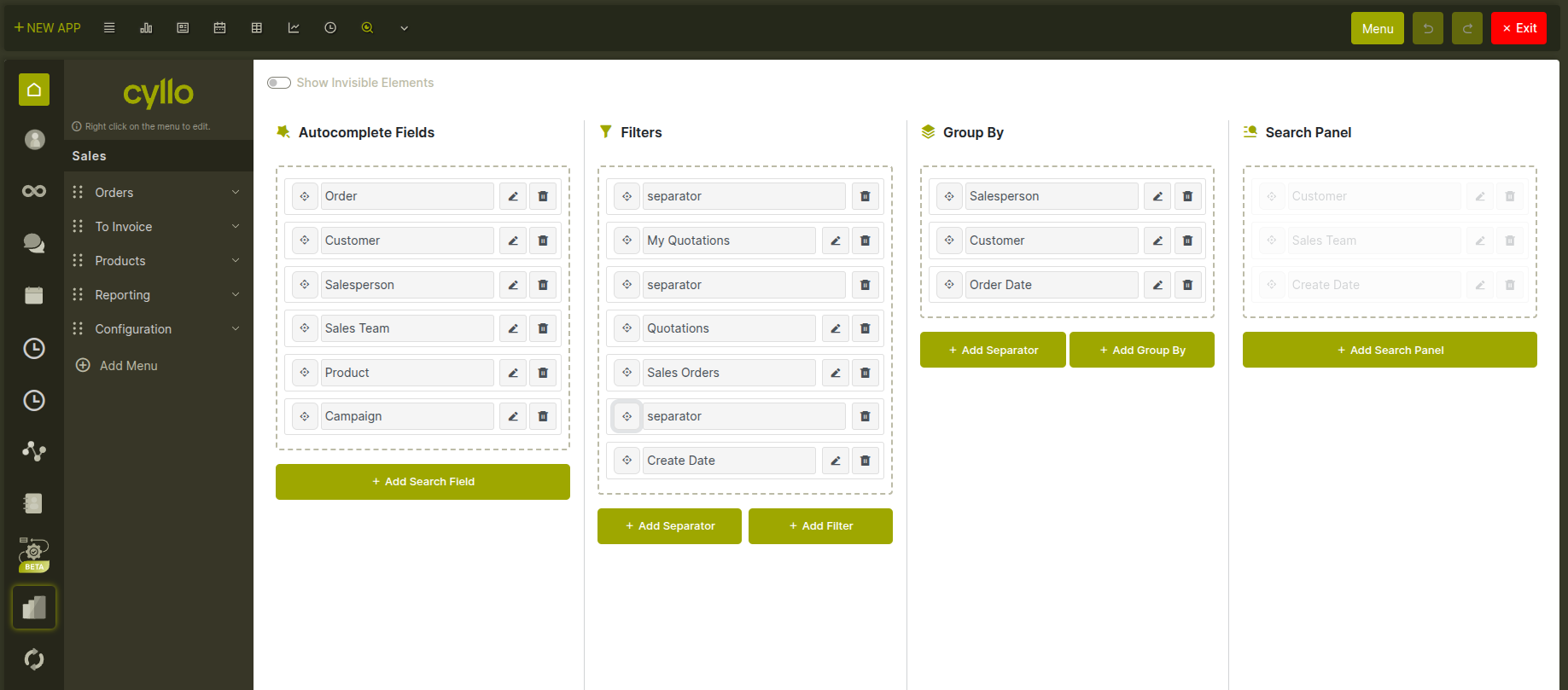
Fig 4.5 — Search view editor showing search fields, predefined filters, group-by options, and search panel toggle
4.7 Calendar view
The calendar view displays records on a calendar based on date fields. Configuration includes:
- Start date field — the field that determines where an event appears on the calendar.
- End date field — optional. If set, events span across multiple days between start and end.
- Color field — assign different colors to events based on a field value (e.g. color by responsible person or status).
- Default view — whether the calendar opens in day, week, or month mode.
- Card fields — which fields appear inside each event block on the calendar.
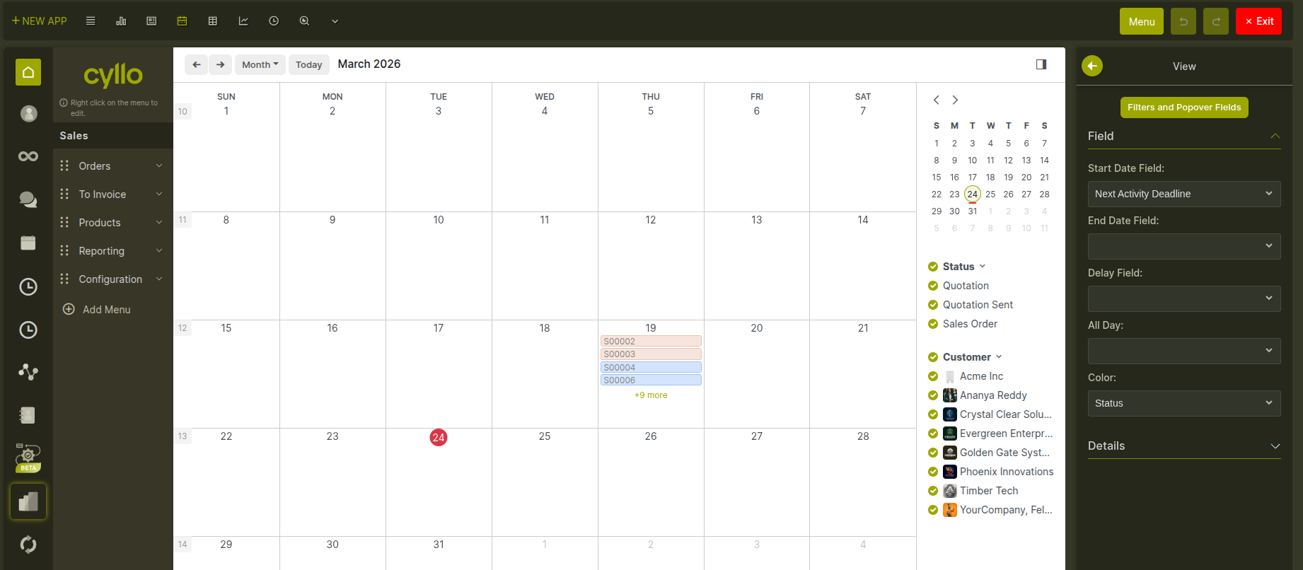
Fig 4.6 — Calendar view in month mode showing multi-day events with color coding by status
4.8 Graph and pivot views
Graph views show model data as bar charts, line charts, or pie charts. Pivot views display a cross-table for aggregating and comparing values.
- In the graph editor, you choose which field to use as the grouping dimension and which measure to plot. You can also set the chart type (bar, line, or pie) and the date grouping interval.
- In the pivot editor, you define which fields go on the rows, which go on the columns, and which values are aggregated as measures.
- Both views can be created on demand if they don't already exist for a model — click the view type in the toolbar to create it.
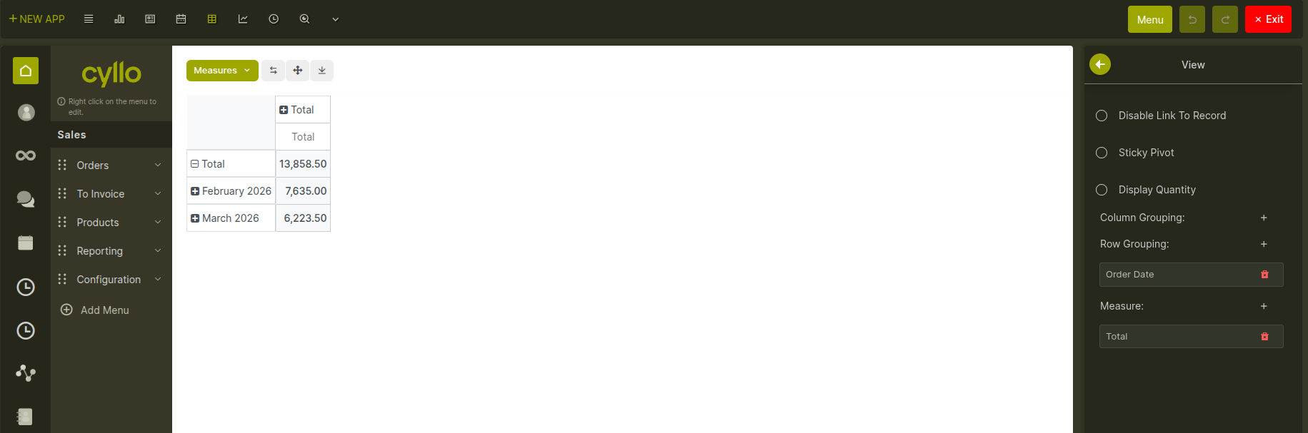
Fig 4.7 — Pivot view editor showing row, column, and measure configuration
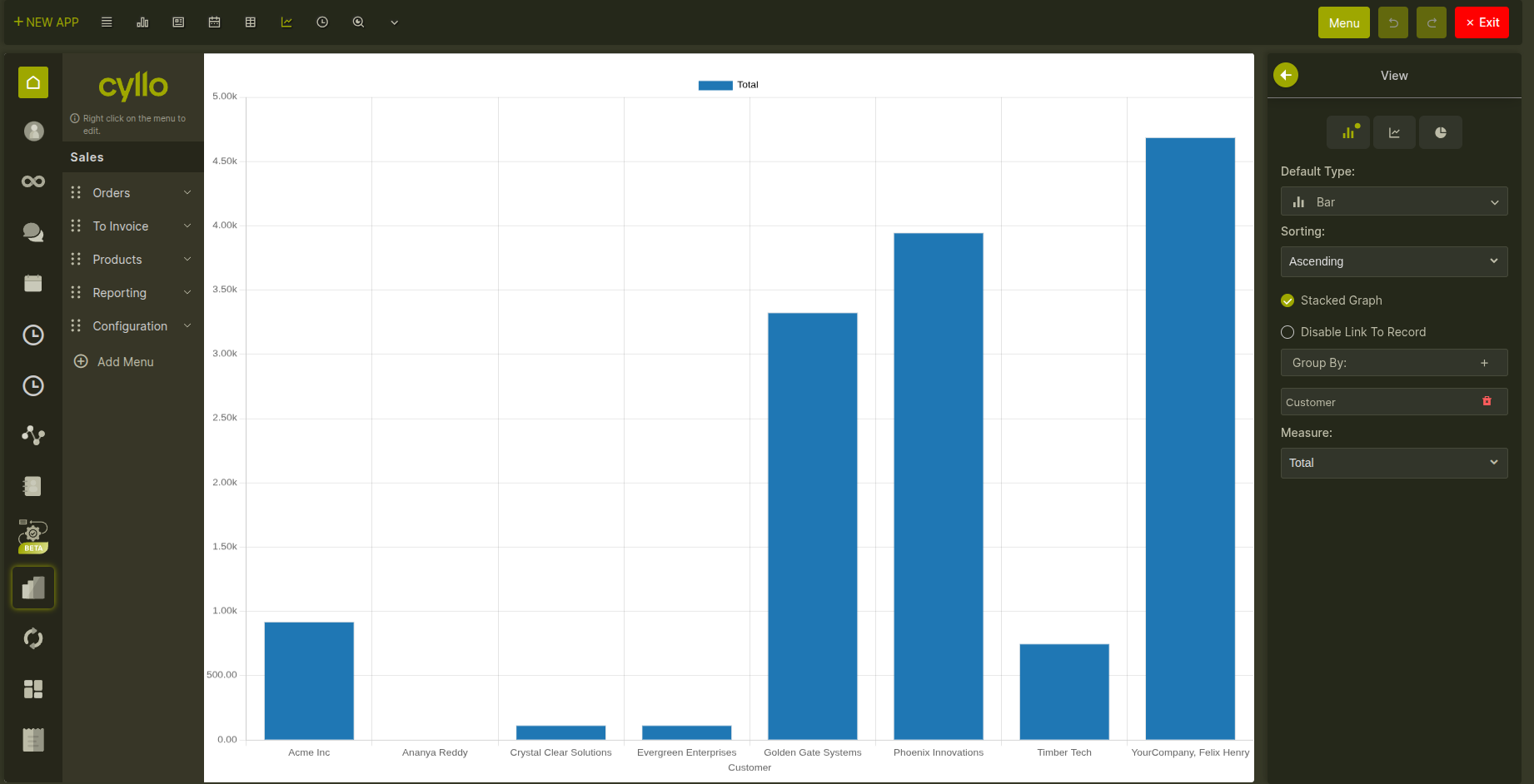
Fig 4.8 — Graph view editor showing a bar chart with grouping dimension and measure selectors
4.9 Activity view
The activity view shows scheduled activities — calls, emails, meetings — grouped by record. It is only available on models that support Cyllo's messaging and activity features. In the editor, you can add or remove the fields displayed in each activity row, control their styling (bold, muted), and reorder them.
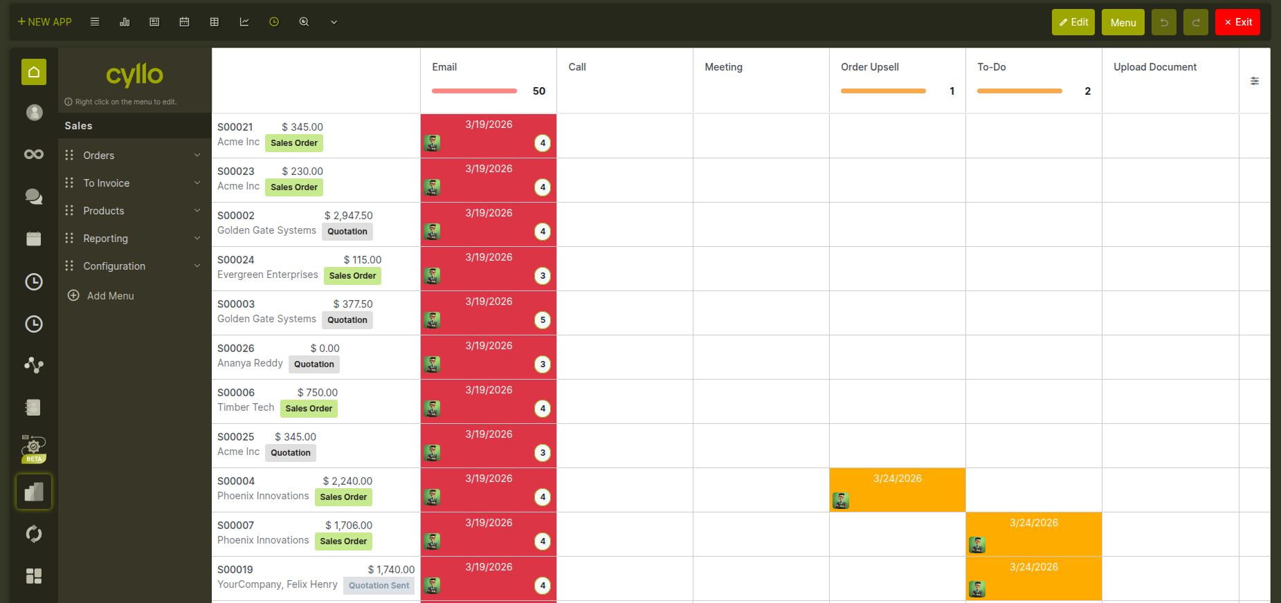
Fig 4.9 — Activity view
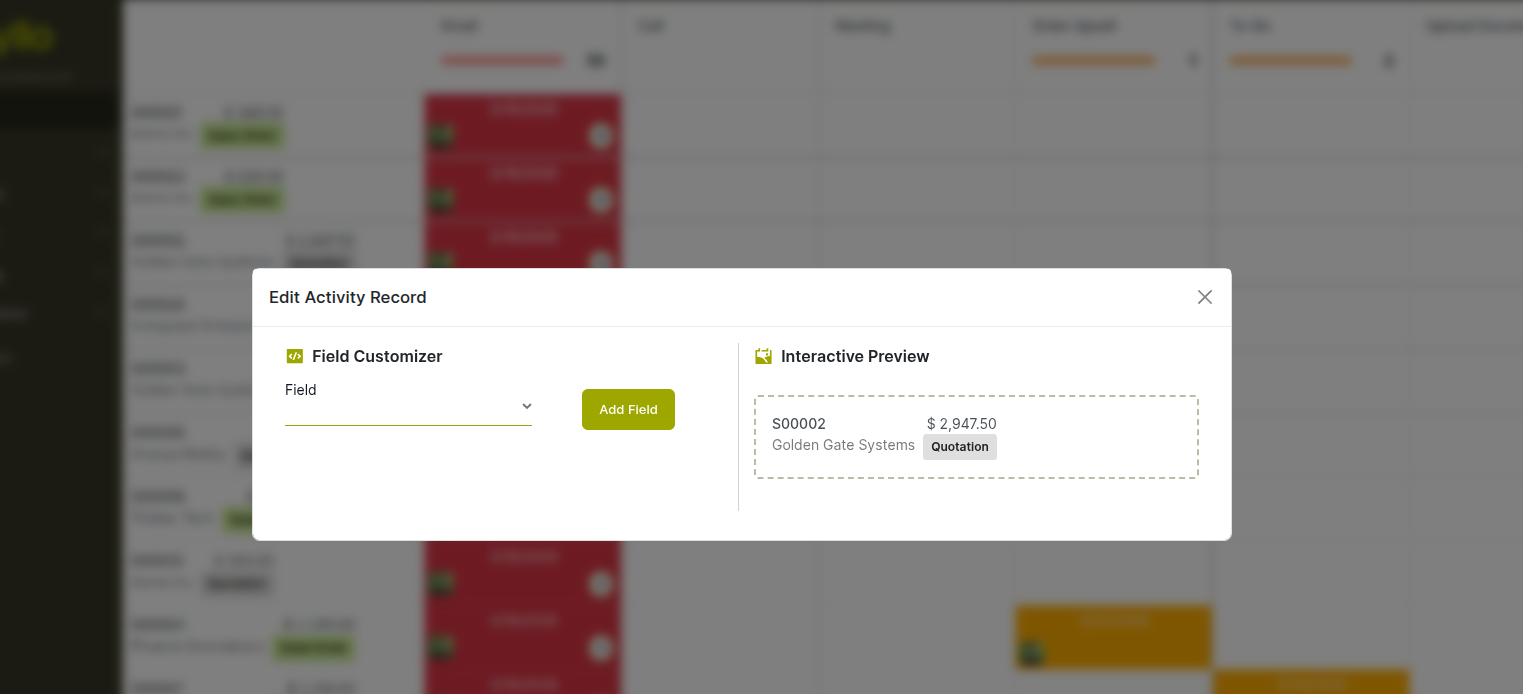
Fig 4.10 — Activity view editor showing rows grouped by record with activity type icons and field controls
4.10 Undo and redo
Every change you make in the view editor can be undone. The Studio toolbar shows Undo and Redo buttons that step backwards and forwards through your edit history. The history is kept for your current browser session — closing the tab clears it, but you can undo freely while you are working.
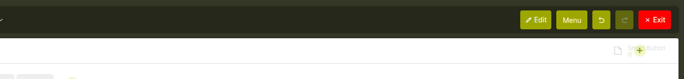
Fig 4.11 — Studio toolbar displaying Undo and Redo controls for navigating edit history.
Note
Undo history is per browser tab. If you have Studio open in two tabs, each tab has its own independent undo history.
5. Access Control
5.1 Access rights
Access rights define which groups of users can work with a model's records. Each rule specifies a user group and which of the four basic operations that group is allowed to perform: reading records, editing existing records, creating new ones, and deleting them. For apps created through Studio, user access is configured automatically — regular users get read, create, and edit access, while administrators also get delete access. You can view and change these rules at any time. How to open Access Rights for the current model:
- In Studio mode, click Access Rights in the Studio Menu Button.
- The screen shows all access rules for the current model.
- Click any row to change the group or adjust which operations are allowed.
- Click New to add an access rule for an additional user group.
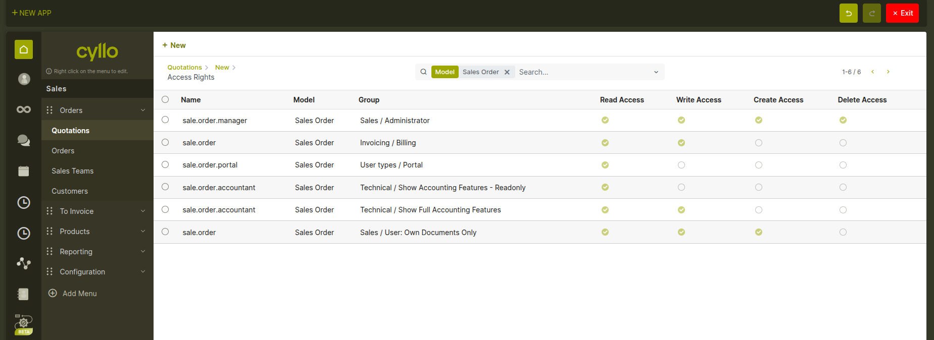
Fig 5.1 — Access Rights screen showing the list of rules for the current model, with group names and Read / Write / Create / Delete toggles
5.2 Record rules
Record rules add a second layer of control on top of access rights. While access rights determine whether a user group can read or edit records at all, record rules determine which specific records that group can see — based on field values on each record. For example, a record rule can ensure that each salesperson only sees their own leads, or that a regional manager only sees records belonging to their region. Record rules are evaluated automatically in the background and are invisible to end users. How to open Record Rules:
- In Studio mode, click Record Rules in the Studio toolbar (next to Access Rights).
- The screen shows all record rules for the current model.
- Each rule has a name, the user group it applies to, a filter condition, and checkboxes for which operations it restricts.
- Click New to add a new rule, or click an existing rule to edit it.
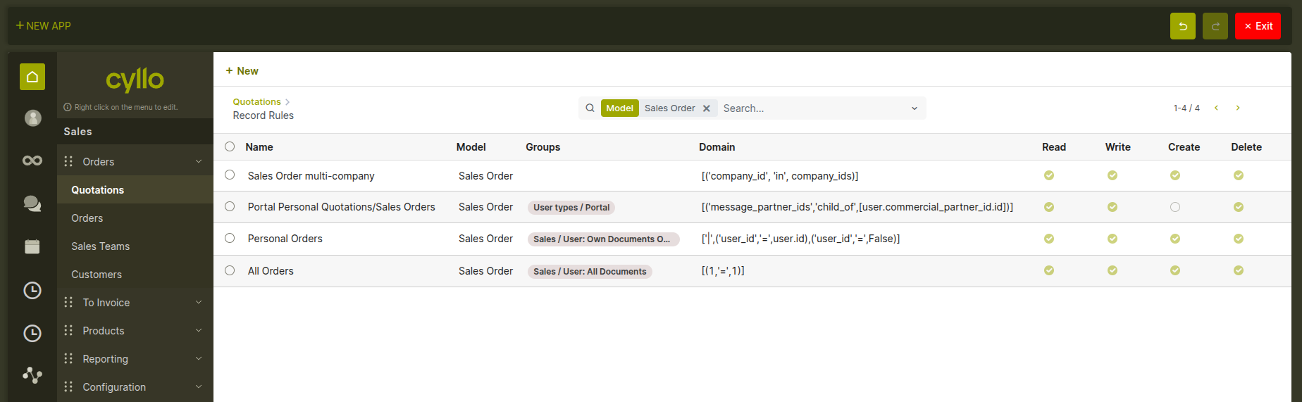
Fig 5.2 — Record Rules screen showing rules for the current model, with the filter condition editor and operation checkboxes
Note
A user who belongs to multiple groups with different record rules can see the combined set of records allowed by all their applicable rules. Record rules narrow access — they do not grant access beyond what the access rights allow.
6. Studio AI — App Generation
6.1 What is Studio AI?
Studio AI is an optional extension to Cyllo Studio that lets you describe a new application in plain language and have it built for you automatically. Instead of creating a model, adding fields one by one, and designing screens manually, you simply tell Studio AI what you need — and it generates a complete, working application from your description. The result is a fully functional Cyllo app with its own data model, default screens, and navigation menu, ready to use immediately. You can then refine it further using follow-up instructions in the same conversation, or continue customizing it using the standard Studio tools.
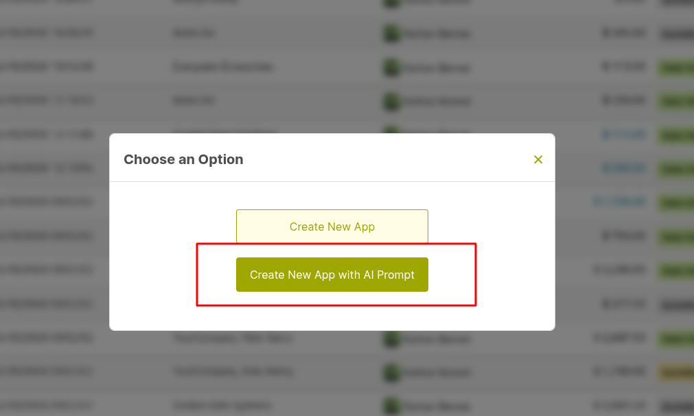
Fig 6.1 — Option to create a new app using Studio AI prompt from the app creation dialog.
6.2 Generating an app from a prompt
Opening Studio AI presents a simple chat interface. You describe the app you want in your own words — no special format or technical language is required. How to generate an app:
- In Studio mode, click New App in the toolbar and select the Generate with AI option.
- Type a description of the application you want to create. Be as specific as you like about what data it should track and how it should work.
- Studio AI reads your prompt, identifies the fields, relationships, and screens needed, and shows you a summary of what it will build.
- Review the summary and confirm. Studio AI creates and installs the app — it appears in the navigation menu and is ready to use.
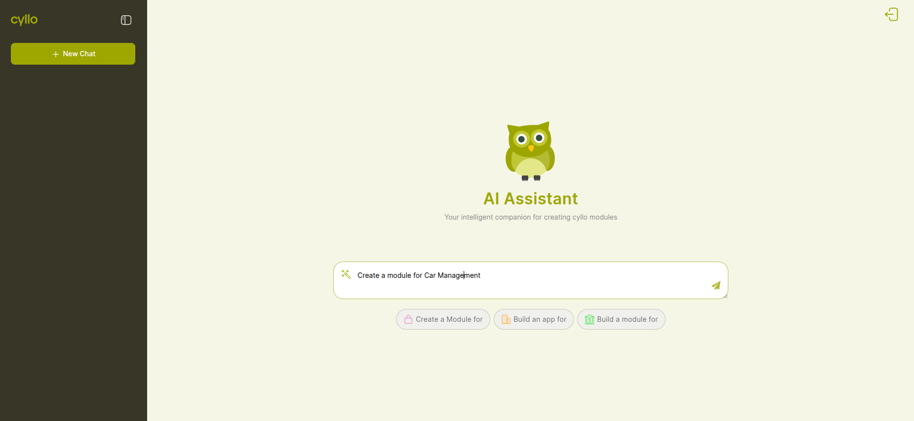
Fig 6.2 — Chat-based Studio AI interface used to create applications by entering a descriptive prompt
Tips for writing a good prompt:
- Mention what the app tracks — "Track equipment inspections", "Manage training sessions", "Record supplier evaluations".
- Describe the key pieces of information — "Each record should have a date, a responsible person, a status, and notes".
- Mention connections to other data — "Link each record to a customer" or "Link to an existing sales order".
- Describe how you want to see the records — "Show them as a list grouped by status" or "Display as a Kanban board by stage".
Note
You do not need to use any technical terms. Studio AI understands plain business language — words like "customer", "employee", and "product" are automatically matched to the right data in Cyllo.
6.3 Reviewing and using a generated app
After Studio AI generates an app, it is immediately available in the navigation menu. Before sharing it with your team, it is good practice to review it:
- Open the app and create a test record to confirm the fields and required settings work as expected.
- Switch to Studio edit mode on the form or list view to make any layout adjustments using the standard view editor.
- Check the access rights for the model to confirm the right user groups have the permissions they need.
- If something is not right, continue the Studio AI conversation with a correction — or edit the model and views directly in Studio.
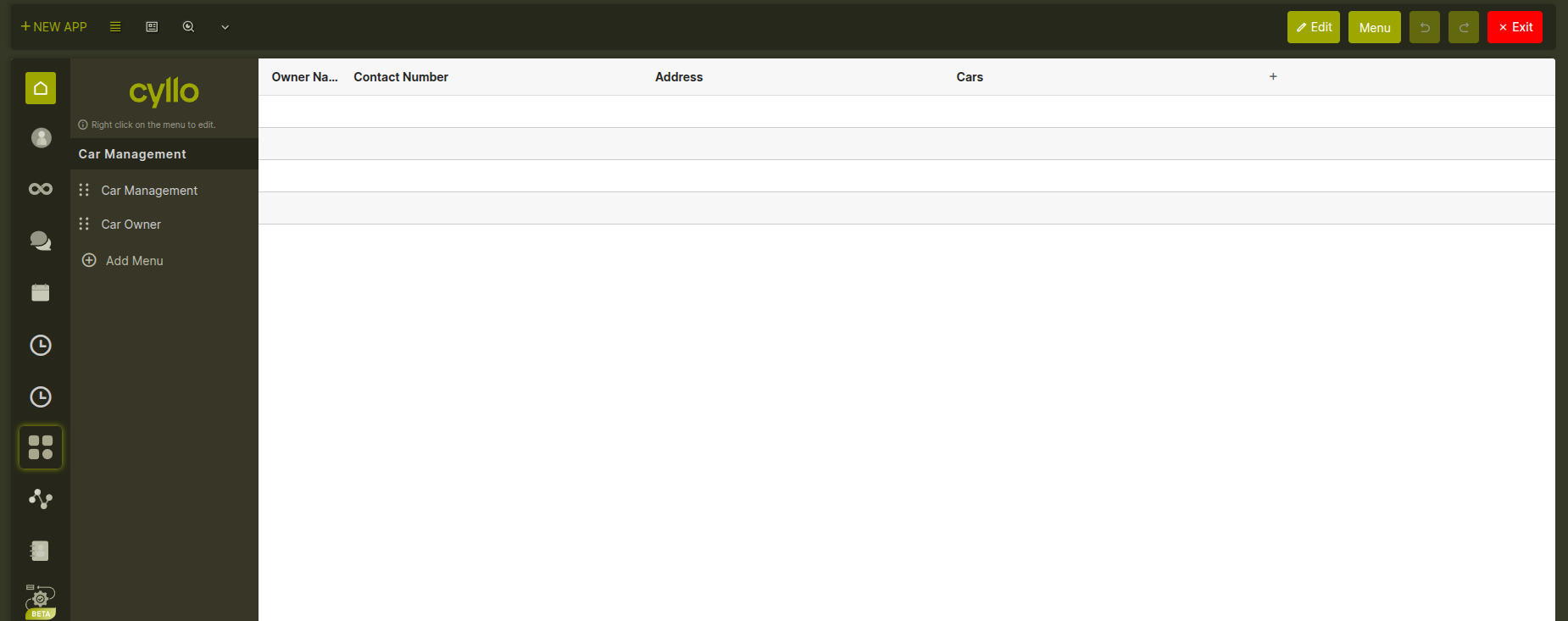
Fig 6.3 — Generated app interface showing the default list view and navigation menu after creation using Studio AI.
7. Studio Toolbar
When Studio is active, a specialized toolbar replaces the standard Cyllo top bar. It contains everything needed to navigate and customize the current module.
- Undo / Redo buttons — step backward or forward through view changes made in the current session.
- New App — opens the app creation wizard.
- View type switcher — icons for list, form, kanban, search, calendar, graph, pivot, and activity. Click one to switch to that view or create it if it doesn't exist.
- Edit button — toggles the current view between preview mode (how users see it) and edit mode (drag-and-drop canvas).
- Menu Button –
- Close Studio — exits Studio mode and returns to the normal Cyllo interface.

Fig 7.1 — Studio toolbar displaying key controls including Undo/Redo, view switcher, edit toggle, and menu options.
8. Configuration
Granting Studio access to a user Studio access is controlled by a single permission setting on the user account. How to enable Studio for a user:
- Go to Settings → Users & Companies → Users.
- Open the user's record.
- In the Technical section, enable the ERP Manager checkbox.
- Save. The user will see the Studio icon in the top bar the next time they log in or refresh the page.
Note
The ERP Manager permission gives broad administrative control over the entire Cyllo configuration. Grant it only to users who are responsible for system administration.
Removing Studio access To remove Studio access from a user, uncheck the ERP Manager option on their user record and save. The Studio icon disappears from their interface immediately on their next page load.